Distinct, Memorable and Instantly Brand-Identifiable Compact Pedal Enclosures Part 2 - Trade Dress Edition

So this is the second of this series - where the first was more about the uniqueness of the enclosure shape - more structural really - covering the overall form factor. While this edition is more about ’Trade Dress’ or the Memorability of the Aesthetics - style of graphics, consistency of theme, and consistency of control topology - doing something in a consistently measurable way that makes that pedal instantly recognisable from afar as belonging to a certain single brand.
So this one is really about the Distinctiveness of the surface styling and consistency of application of that Design Theme applied across a Range or Series of pedals. There were a few brands that missed the cut here as there was insufficient consistency across that whole range - for instance Matthews Effects started off very thematically coherent, but has fairly recently broken away from that convention.
From this selection 2 pedals could have sat in the previous more unique enclosure shape focused edition - the Pettyjohn Electronics Foundry Series, and the Tru-Fi range - both very consistently identifiable.
So this time around there is a mix of objective and subjective criteria in evaluating which brands are most easily and immediately identifiable by their ’Trade Dress’. I may mention some near misses at the end - while this is all about what got included and why!
Note that apart from the Pettyjohn and Tru-Fi - these are all very much standard 1590B / 125B type compact enclosures - just plain rectangles really when without the graphics and controls!
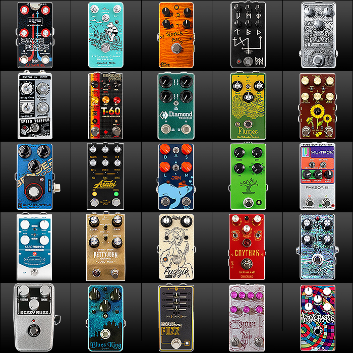
Here is the PT 2 roll call :
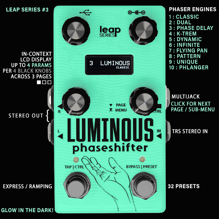
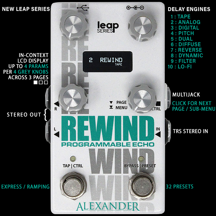
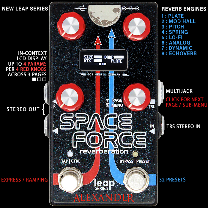
- Alexander Pedals (Leap Series) : since 2022 |
- Animals Pedal : since 2015
- BJFE (Björn Juhl FörstärkarElektronik : since 2000
- Blackhawk Amps : since 2016
- Colortone Pedals : since 2020
- Death By Audio : since 2002
- Demedash Effects : since 2012
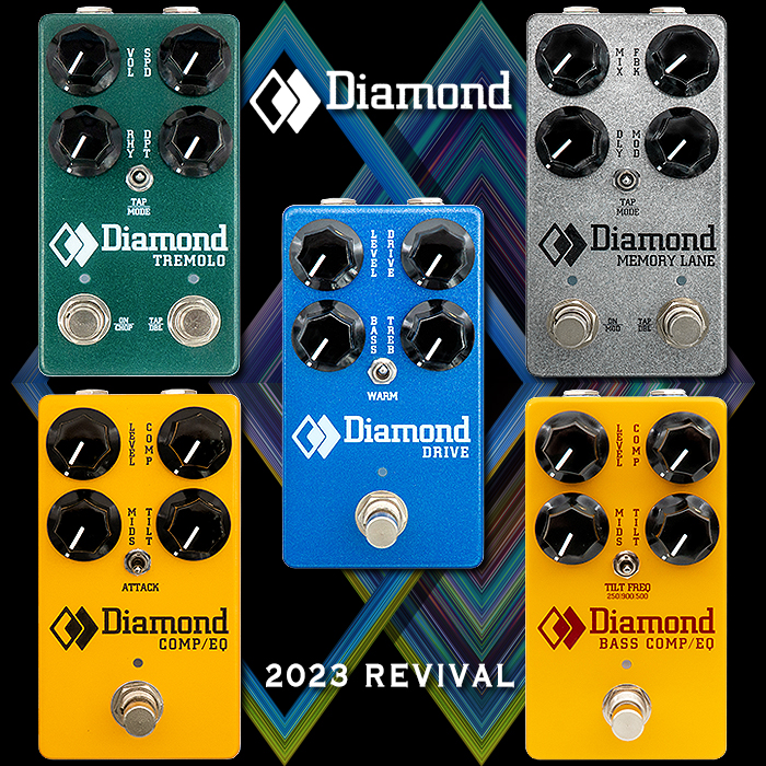
- Diamond Pedals (Reissues) : since 2023*
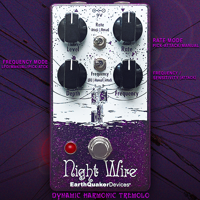
- EarthQuaker Devices : since 2004
- Flower Pedals : since 2017
- Guitarsystems : since 2000
- Jackson Audio : since 2016
- JAM Pedals : since 2007
- JHS Pedals : since 2007
- Mu-Tron (Vintage Silver Series) : sort of since 1972, revived in 2013
- Origin Effects : since 2012
- Pettyjohn Electronics (Foundry Series) : since 2020
- Sitek Guitar Electronics : since 2016
- Spaceman Effects : since 2009
- Tanabe.TV : since 2007 (Abalone)
- Tru-Fi : since 2016
- VFE (V2 Silhouette Editions) : c 2015 / 2016
- Walrus Audio (Fundamentals Series) : since 2023
- Zander Circuitry (Compact Series) : since 2020
- Zvex : since 1995, Vertical Series since 2018
And here follow some further details and full rationale - per chosen enclosure type! :

Alexander Pedals (Leap Series) : since 2022 | e.g. Space Force Multi-Mode Reverb
I've always thought that the Alexander Pedals Neo series onwards had a very distinctive look - but with the new Leap Series - it's even more so - 4 knobs with a screen, and dual footswitches - with sharp but simple graphics - I can spot one of these from a great distance!
Animals Pedal : since 2015 | e.g. Tioga Road Cycling Distortion (W&C Rat)
Very Japanese in that they feature cutesy Bear-themed sort of comic strip artworks - really distinctive for me - mostly featuring said bear in various scenarios that support the naming of the pedal. Also underlined by a smart mostly pastel colour palette. Very recognisable!
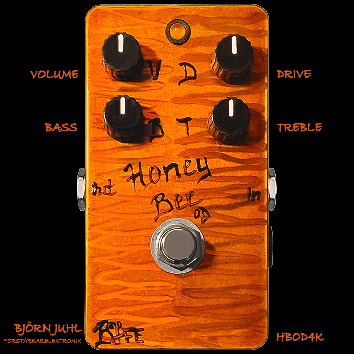
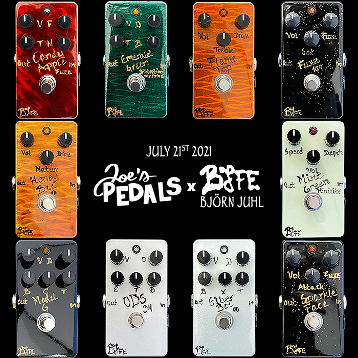
BJFE (Björn Juhl FörstärkarElektronik : since 2000 | e.g. Honey Bee 4K
This might be a controversial choice - where these are still hand-painted and lettered by Björn's wife Eva in very distinctive fashion. Really clever choice of metallic tone paints with some criss-cross strokes typically giving textural light and dark accents - then rounded off by Eva's very identifiable scripted lettering. I actually really like these - while some feel they're a little DIY in aesthetic values - you can't argue that this isn't immediately identifiable as BJFE though!
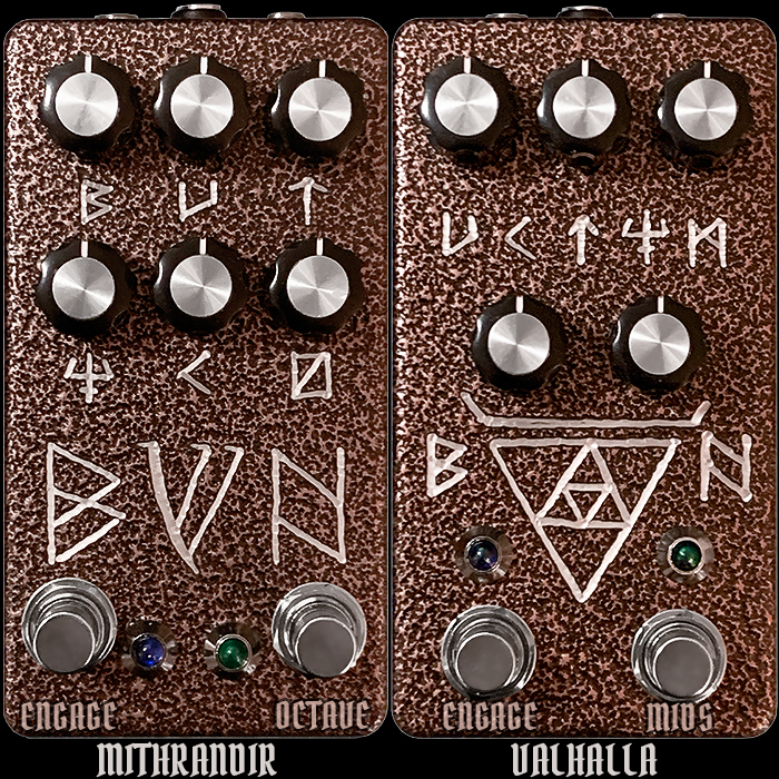
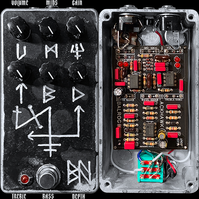
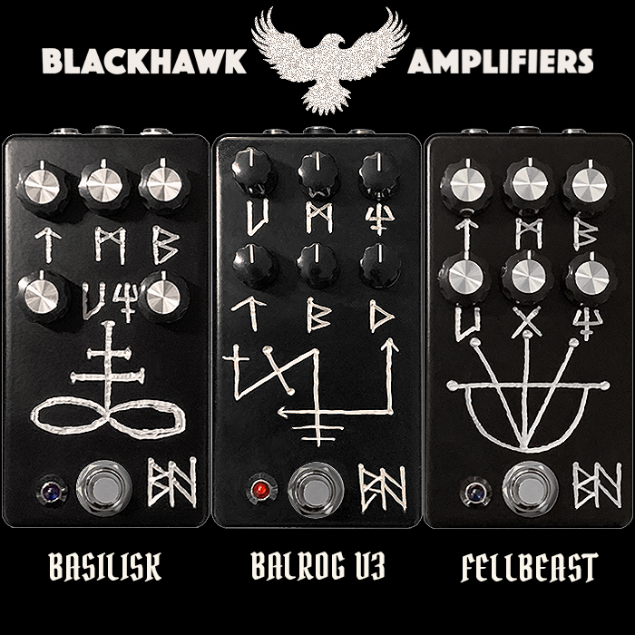
Blackhawk Amps : since 2016 | e.g. Balrog (V3) High Gain Distortion
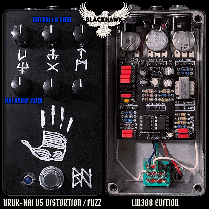
Brooks Blackhawk is another that has evolved a very identifiable visual language - based on etched / engraved runic and tribal symbols. I would say not too dissimilar in concept to BJFE - typically more monochromatic and iconographic though. Looks a bit mystical and mythical and mysterious at first glance - but a logical pattern very soon emerges - actually very striking and memorable really.
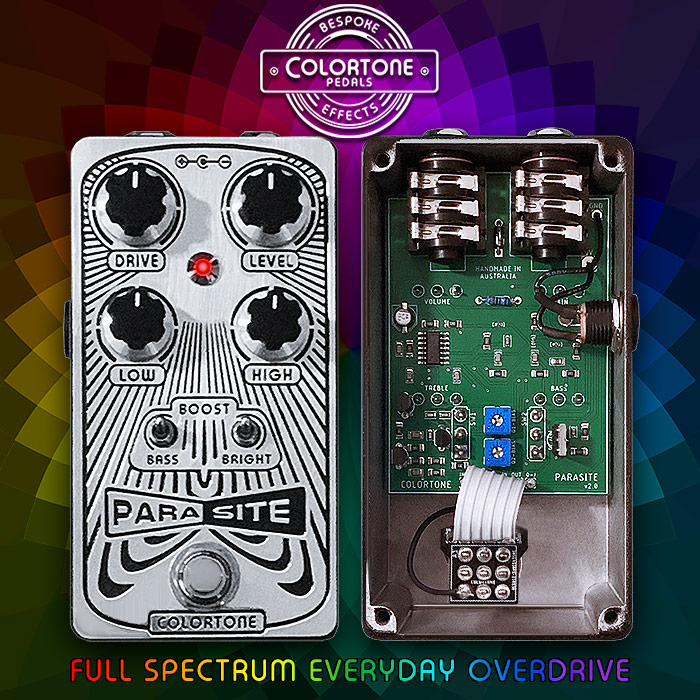
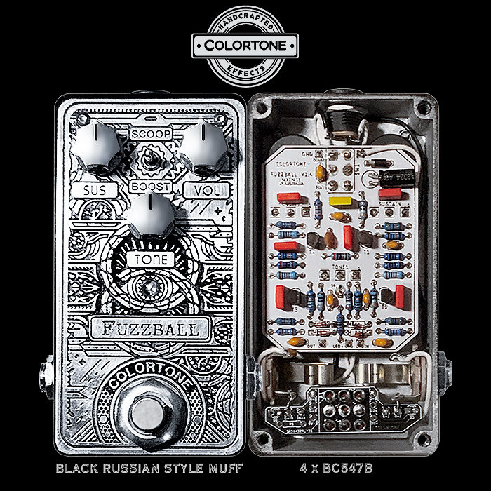
Colortone Pedals : since 2020 : e.g. Fuzzball Black Russian Muff
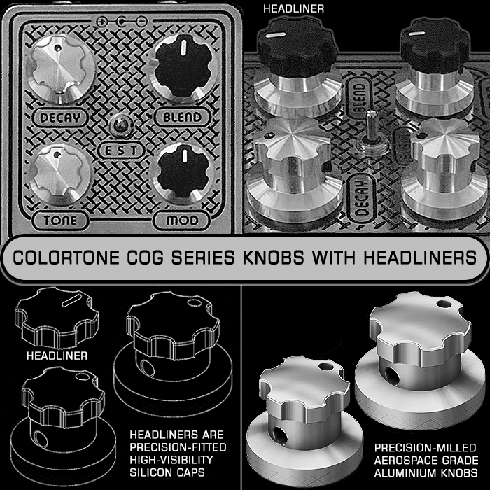
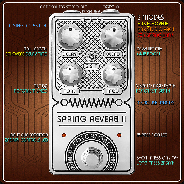
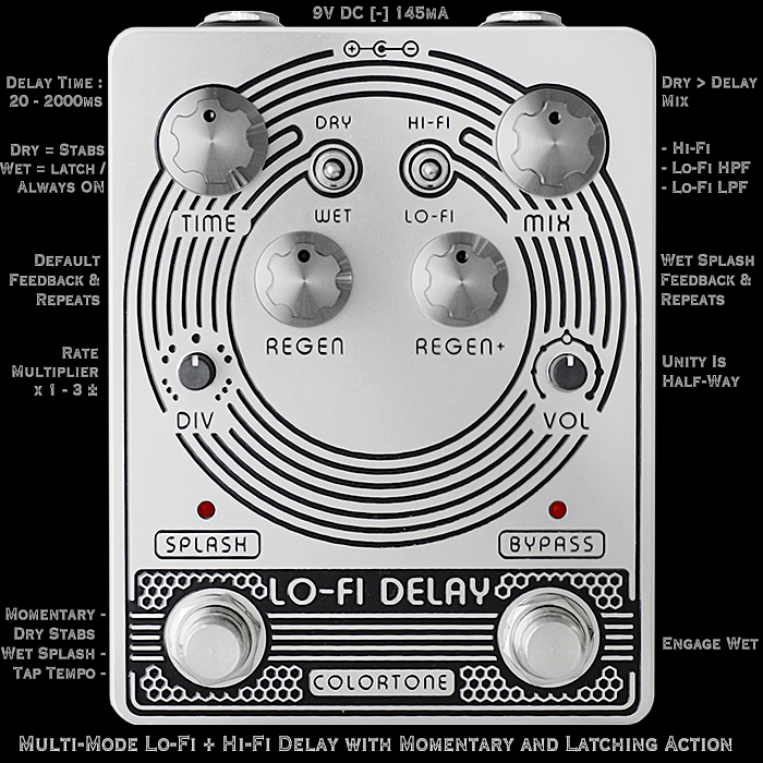
My good friend AD Hauser is as detail obsessed as I - and really goes the extra mile on component selection and quality of finish. His geometric mechanically etched resin filled artworks - against the heavily buffed 'silver' of the enclosures just looks stunning from every angle. And he now has is own design of knobs too - with additional Headliner caps for added visibility. The range is being somewhat re-tooled at the moment as the new knobs take a different shaft to the originals - all these should be available fairly soon further honed and refined! AD has a few compact enclosure editions which qualifies him for this selection - very striking design indeed - and immaculate attention to detail!
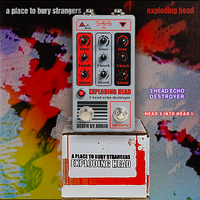
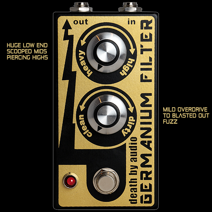
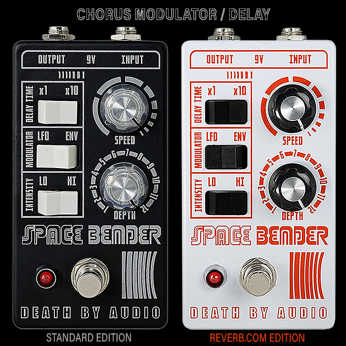
Death By Audio : since 2002 | e.g. Speed Tripper Feedback Phasing Delay
So iconic is the Death By Audio style of graphic design - that you can occasionally mistake other brands' pedals as being of DBA origin - for instance Beautiful Noise Effects Exploder Distortion - which at first glance I thought was a new DBA pedal. DBA used to favour slightly oversized enclosures - but more recently they've been rolling out some really neat compact enclosures - indeed like the above limited edition collaboration Speed Tripper Feedback Passing Delay!
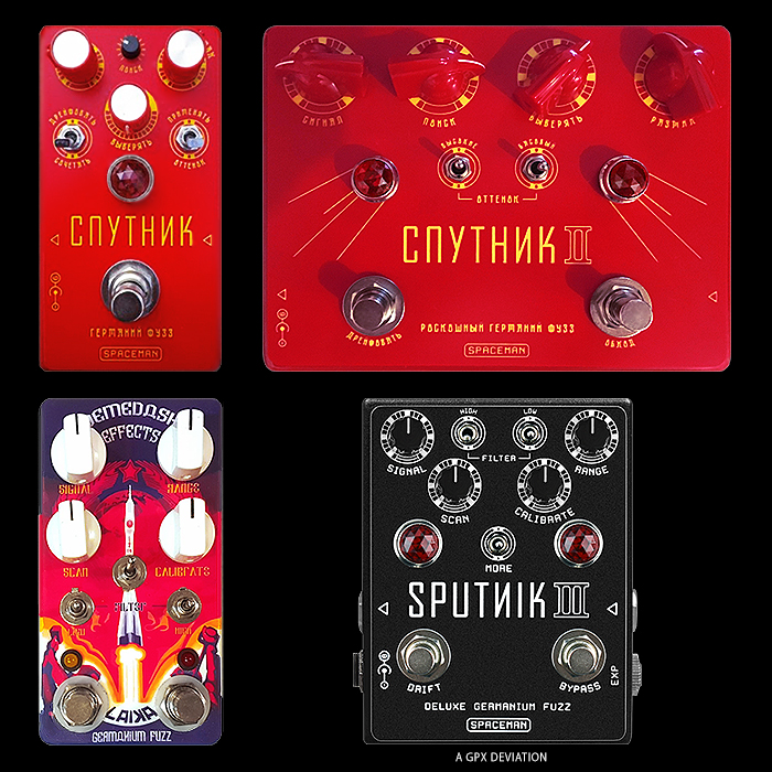
Demedash Effects : since 2012 | e.g. T-60 Analog Modulator
Steve Demedash mines incredibly iconic 80's music and electronics media packaging - typically with a colourful striped theme - and particularly evident on the T-60 and T-120 pedals - but also to a degree on the 112+ Preamp. Those stripey artworks are particularly evocative of an innovative period in packaging - where the original source materials were design classics in their own right - and how Steve has adapted them to his pedals makes them equally evocative and memorable!
Diamond Pedals (Reissues) : since 2023* | e.g. Tremolo
So Diamond Pedals actually go back to 2003 - while back then they were largely oversized enclosures - and the compact editions evolved later. While SolidGoldFX's recent revival of the brand has all the pedals in the range now in compact enclosures. Diamond were very smart with their colour choices - and their Yellow is very synonymous with Compressors, as is their Green with Tremolo and Silver with Memory Lane / tap-tempo analog (+sounding) Delays. I've selected the Tremolo from the recent relaunched range - as that's the one that appeals the most to me - and sill has an iconic colour! I guess Diamond sit somewhere among Boss and MXR in the stark simplicity of their tonal colourway approach!
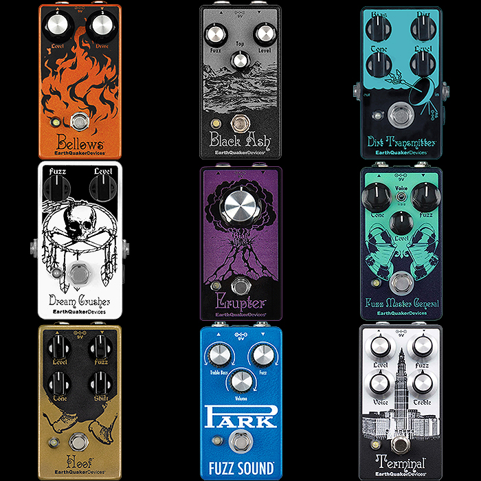
EarthQuaker Devices : since 2004 | e.g. Plumes Small Signal Shredder
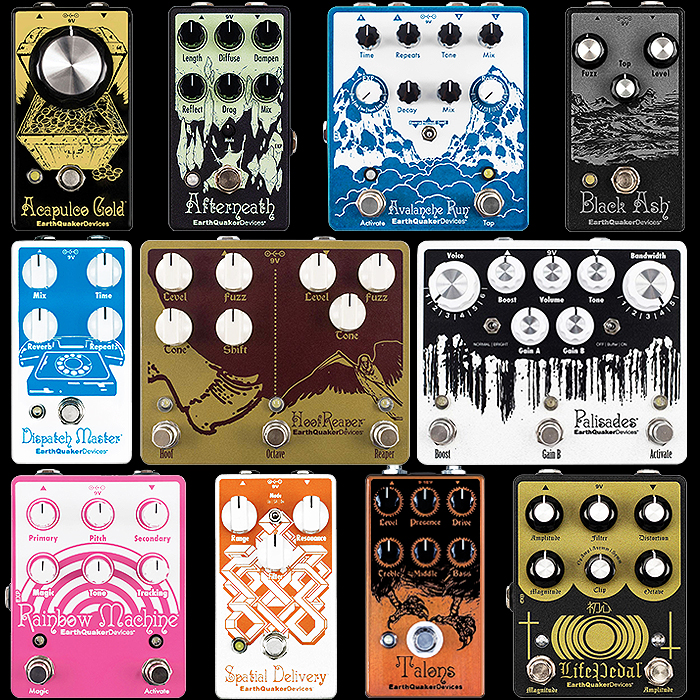
Jamie Lidell's EarthQuaker has long had a very distinct visual identity which is typified by 2-Tone illustrations - often white Against a primary or jewel hue, or Yellow on Green as in our example. There are some outliers within the collection - while the vast majority have a DuoTone nature with a lighter hue paired with a much stronger accent colour. The only pedals in the current range that don't quite fit that mould are the Park Fuzz Sound, Sunn O))) Life pedal and Swiss Things utility pedal - everything else fits the same sort of design theme / pattern - so where there are often slightly different styles of illustration - the consistent theme hold everything together and makes it uniform. For the Plumes - particularly in Japan - there have been nearly 20 different colourways - all based on the same DuoTone theme!
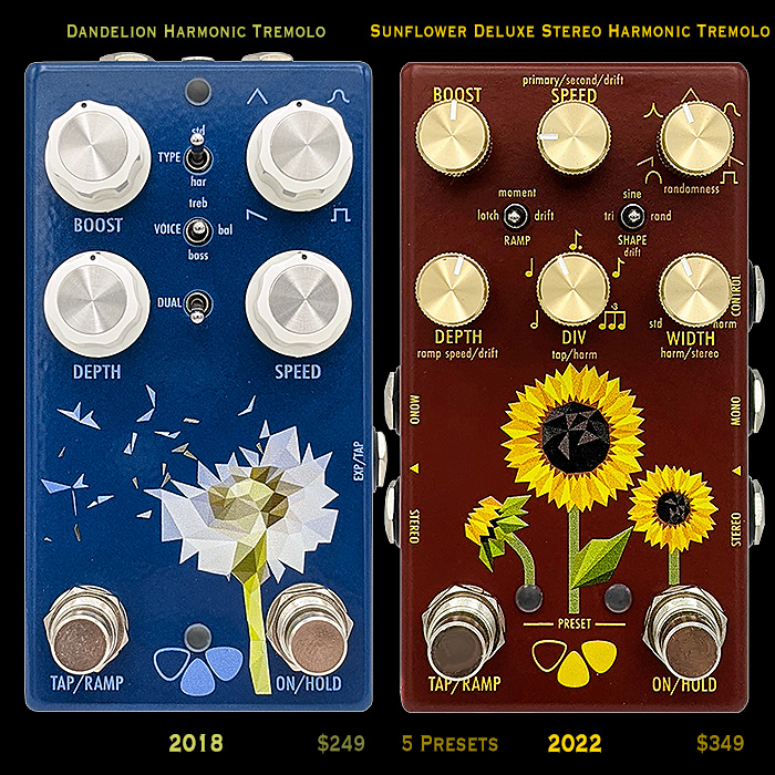
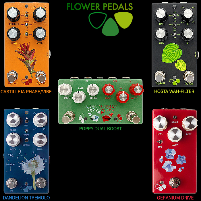
Flower Pedals : since 2017 | e.g. Sunflower Deluxe Harmonic Tremolo
I've tried several times to reach out to Flower Pedals' Matt Kauffman - who has somewhat resoundingly snubbed me - despite my being and ardent advocate of his brand, and owning 3 of his very best pedals. Each of those is graphically and thematically very identifiable with a typically slightly modernist floral theme - which is taken to new heights on the recent Sunflower Tremolo. I did his range overview a couple of years back - and it was striking just how solid a family portrait those then 5 pedals created. Clever use of colour and graphics - with each enclosure very much looking like a sibling to what came before. Smart marriage of naming convention and graphics approach really - and it works very well.
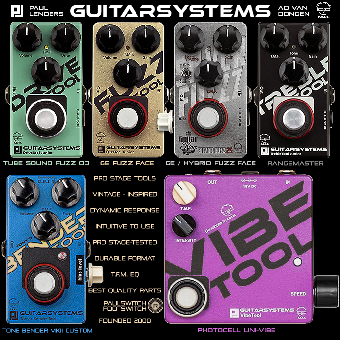
Guitarsystems : since 2000 | e.g. BenderTool Custom TB MKII
A perfect example of a Trade Dress styling - which is heavily accentuated by the proprietary PaulSwitch Footswitch. Again some smart colour choices with diagonal text and that footswitch. Would be nicer if some of the 4-knob pedals had all the dials on the front facia - while this is like several other brands - including Tru-Fi - where the 4th knob always goes on the side of the pedal. The unusual Footswitch really makes it instantly identifiable - but there are a few more details that back that up!
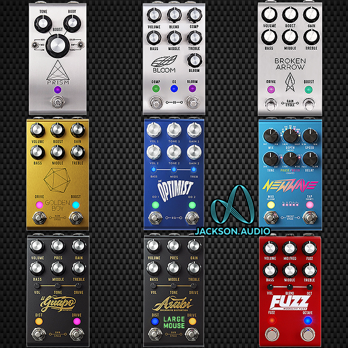
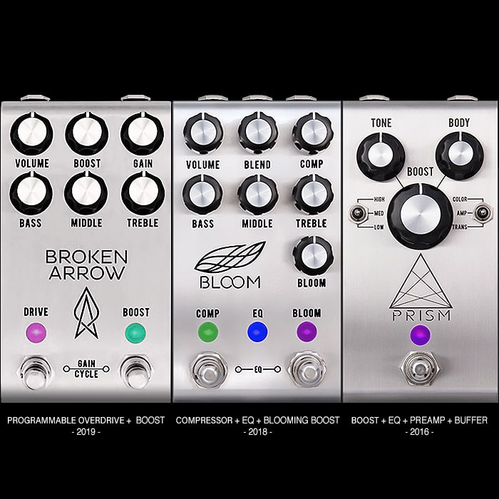
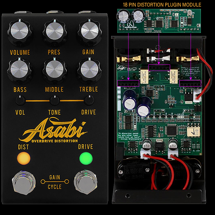
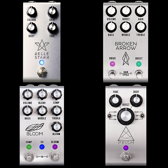
Jackson Audio : since 2016 | e.g. Asabi Overdrive Distortion
Despite my blowout with the head honcho - I still respect the quality of this maker's output. The style of graphics - nature and arrangement of knobs - typical dual-footswitch nature - but also the colour-changing LED's / Lenses - are what give these pedals such a particular look. There are a few outliers in the larger range - but most of the mainline compacts look very similar and are instantly identifiable to me. We've seen the addition of more logotype graphics more recently - while in the main it's still clean fonts plus outline engraved idents - very cool and smart extended features pedals.
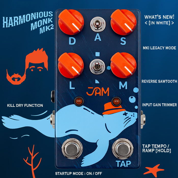
JAM Pedals : since 2007 | e.g. Harmonious Monk MKII Harmonic Tremolo
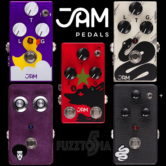
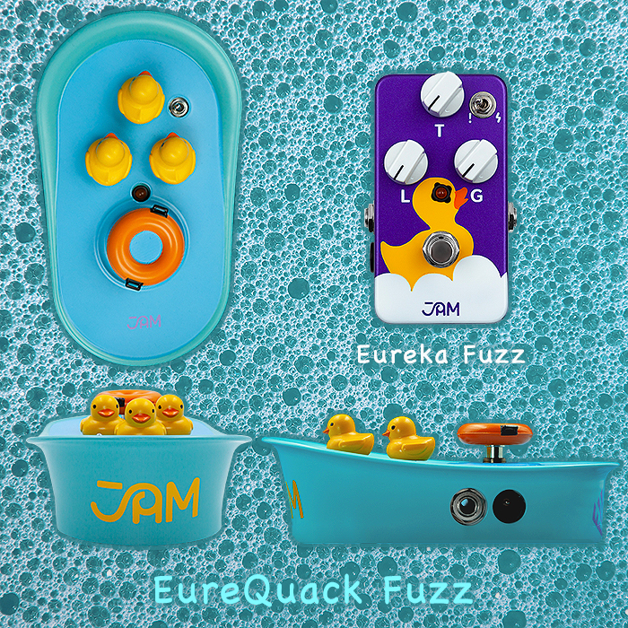
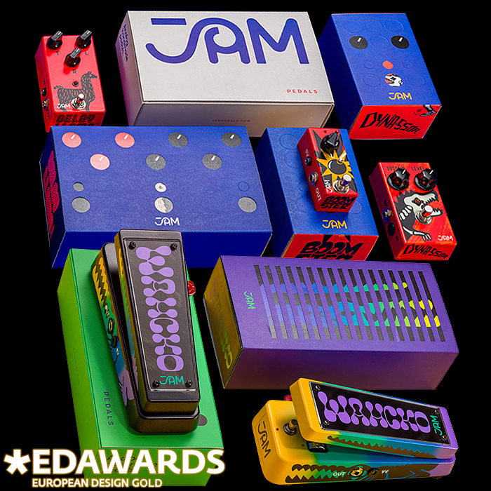
JAM still specialise in hand-painted / stencilled finishes to their pedals - using elegant filled / block illustrations of animals and symbols in the main - strong beautifully complementary colours with fantastic attention to detail right the way through the production cycle - including their award-winning packaging. An incredibly iconic and distinct brand of pedals.
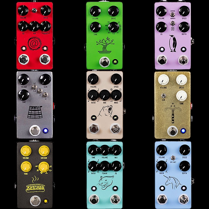
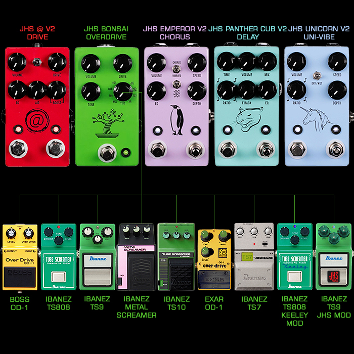
JHS Pedals : since 2007 | e.g. Bonsai 9-Mode Multi-Screamer
Josh Scott evolved his style of symbolic illustrations - from initially using off-the shelf stamps - which popularised this outline format - which then evolved to the current and more robust UV-Printing staple. Some of the icon choices / designs are particularly apt - including this part circuit / part bonsai tree illustration. There are now many brands that sort of copy this template now utilising a single iconic illustration without further text - Josh Scott very much helped popularise this style - while his brand is still the leader and pace-setter for this aesthetic.
Mu-Tron (Vintage Silver Series) : sort of since 1972, revived in 2013 | e.g. Phasor III
There have been a few different iterations of the revived Mu-Tron brand artwork - while the most striking of those is the original 70's styled 'Vintage Silver Series' which uses those 70's block colours in new and interesting ways. It's slightly disappointing to see Behringer and Warm Audio ripping off that Trade Dress - it's ungentlemanly behaviour at the very least - which is why I personally boycott those brands. Mu-Tron still makes decent stuff - while their quality control isn't always at 100% and both I and some of my dealer friends have had some issues with these pedals. They look great though and instantly recognisable - it should be criminal for Warm Audio and Behringer to rip off that Trade Dress - while evidently some copyright has lapsed.

Origin Effects : since 2012 | e.g. M-EQ Driver, Mid Booster & Drive
I probably should have included this brand in the first part of this exercise - while I was in two minds as to which would be my enclosure of choice - and whether I should go with the larger slightly oversized RevivalDRIVE or Cali76 singles or rather the actual properly compact size recent series - which started with the Halcyon. So while we now have standard 4-knob arrangements in place of the former larger series 6-knobs - this new series still carries all the obvious brand markers that make up that distinct Trade Dress - with subtle variations. I was a bit slow on the pickup - but the Eurorack cutouts on the M-EQ panel design are proper genius - that plus that very attractive shade of blue make this my preferred representative for the range. Origin are the very epitome of quality - and that is carried through their own design of brushed aluminium knobs - they've sort of become reliably expensive - but that is largely an indicator of their quality.
Pettyjohn Electronics (Foundry Series) : since 2020 | e.g. Pettyjohn Gold MKII
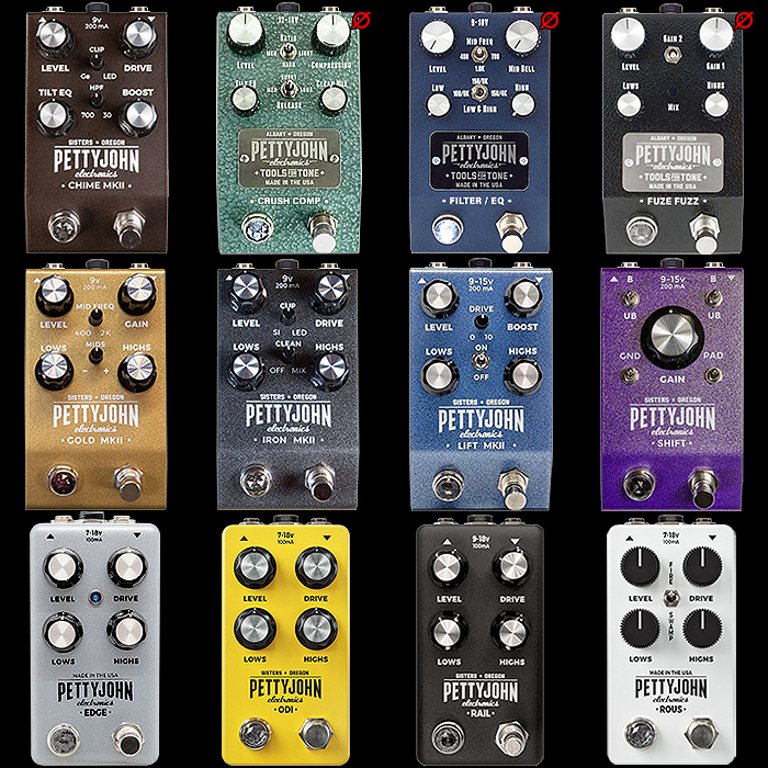
Another brand that probably should have featured in the previous episode too - it's Foundry series is particularly iconic and identifiable - with its sloping front and position of Jewel LED - also that same kind of 4-knob topology with 2 smaller knobs or toggle-switches. Supposedly the Foundry series is ended now with the MKIII editions about to take shape - will be interesting to see exactly how they vary in look to their predecessors. They're very slightly larger than 125B - slightly wider too - but by fairly small fractions. Some clever colour choices again - these have always felt really solid and high quality - and this particular style of enclosure if very identifiable with Pettyjohn.
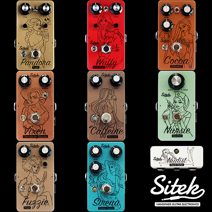
Sitek Guitar Electronics : since 2016 | e.g. Fuzzie Germanium Fuzz MKII
Andy and Hania have evolved a beautiful style of Illustrated Muses - which so aptly represent the name and nature of each pedal. This slightly sensual style of essentially sort of grown up Disney Princesses has often been misunderstood and misconstrued. Graphic designer Hania designs every artwork - once Andy and Hania have jointly agreed on the name. Andy does the engineering and is one of the most detail-oriented persons I know - always striving to further improve things - where each of these is a real gem. Again some strong colour and texture choices here with particularly fine quality raised print - which just looks superb from every angle. Instantly and consistently recognisable for me!
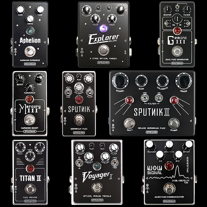
Spaceman Effects : since 2009 | e.g. Sputnik Germanium Fuzz MKI Cyrillic Edition
Spaceman Effects is of course mostly known for it black enclosure designs with etched 2-tone facia plates - which show through to a lighter typically white or yellow substrate. For sake of experiment I thought I would choose my Cyrillic Red Edition of Sputnik - just to see if that design held up across different colour variants - and to me it definitely does - totally and instantly identifiable as Spaceman - where there is an unerring consistency despite distinctly different title fonts and use of a variety of knobs. Something about this formula is just unerringly timeless and elegant!
Tanabe.TV : since 2007 (Abalone) | e.g. Sunkudo Germanium Buzzaround Fuzz
Toshihiko Tanabe has evolved such a unique style here - where his all-Abalone / mother of pearl style facia is instantly identifiable against pretty much anything and everything else out there. The Demon Pedals Kondo-Shifuku facia has some slight similarities while the Tanabe enclosure with its Boss style knobs still stands out as the key originator of that style. Carefully selected Abalone with bold overtype and Japanese Kanji characters still looks pretty distinct and very high quality!
Tru-Fi : since 2016 | e.g. Dizzy Buzz Germanium Buzzaround Fuzz
Teddy Rasch has done a brilliant job of building up the Tru-Fi brand - with its vintage-leaning - but relatively modern dimensions enclosure - with really smart colour and paint-effect choices - with lots of cool sparkly colourways. The only issue I have is that this format really only properly accommodates 3 front-facia knobs and a single footswitch. So you can't add a second footswitch for Octave mode, and if a 4th knobs is needed - it goes on the side of the pedal. These still look incredibly iconic - but do have some functional limitations - and the actual internal circuity is always of the highest quality and sounds amazing.
VFE (V2 Silhouette Editions) : c 2015 / 2016 | e.g. Blues King Blues Breaker
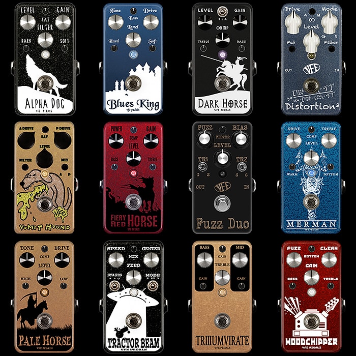
Peter Rutter's 'VonRutter Family Effects' (VFE) has long been an iconic brand which has been retired from service more times than I can remember. It was due to properly reappear again - with the formerly 3 Regular and 3 Small knobs becoming all regular-sized in their latest incarnation. Peter releases the occasional limited batches - but we've not had a proper full reissue - and certainly not with my favourite 'Silhouette' style artworks which materialised in 2015 and 2016. I also feel that the more recent editions with all-the-same 6 knobs loose something of the flavour of the originals - they should at least use different colours or types 0 so you get that same pattern of inverted 'V's. I'm lucky enough to own several of that most iconic edition - while there have still been a few that I've been unable to get my hands on. As far as I'm concerned the most iconic, identifiably and desirable editions of these pedals are those Silhouette artwork editions with 2 different sizes of knobs!
Walrus Audio (Fundamentals Series) : since 2023 | e.g. Fundamental Fuzz
Walrus Audio for sure make some great looking pedals - but their themes are kind of all over the place. For a period they had sort of Space / Sci-Themes, but then interspersed with all kind of incongruities. The Mako Series is obviously very heavily influence by Chase Bliss - and as soon as you see any of those Mako types - the immediate association is with the Case Bliss originals. While with their new Budget line Fundamentals series - Walrus finally have their own uniquely identifiable Trade Dress pedals - each with 4 horizontal slider controls and consistent typography layouts - the look incredibly uniform and entirely distinctive - which is what this particular exercise is all about!
Zander Circuitry (Compact Series) : since 2020 | e.g. Cafetière Distortofuzz
Alex Millar is a really good friend, and I feel I've had some hand in the evolution of the styling of his brand. Back when I first ran into him at guitar shows - I used to badger him as to how similar his 1590-BB enclosures with DM-1510 type knobs were to Wampler - and could easily be misconstrued as such at a glance. I encouraged him to make his knobs more unique, and to evolve a style uniquely his own. Also to ideally shrink down to compact edition enclosures which were and still are the most popular format for pedals by far. So Alex kind of heeded my challenge - while this was all his own work - creating his own style of knobs - obviously somewhat inspired by Chase Bliss, and an artwork style all of his own - with matching Knob and Artwork Accent colours. I feel he's done a quite superb job in evolving a properly unique and instantly identifiable aesthetic of his own - a great example of how to evolve your brand!
Zvex : since 1995, Vertical Series since 2018 | e.g. Vibrophase Vibrato / Phaser
Zachary Vex's brand is another that I campaigned for to make more practical and pedalboard-friendly vertical editions of his pedals - as I did not like the impracticalities of the standard Horizontal editions. The Vertical Editions Series launched in early 2018 - with the Vertical Fuzz Factory, and new Candela Vibrophase Vibrato / Phaser pedal take - being the foremost of those. Both had really vibrant 'Vexter' or printed artwork types - which were nonetheless highly reminiscent of Zvex's core painted enclosures. There have been some custom painted vertical editions - while none of those have been quite so striking as the Vibrophase artwork - which is my choice here. Zvex's hand painted enclosures and deviates are just as striking and iconic as those by JAM Pedals - and each is a unique and distinct aproach!
Final Thoughts

As always I'm pretty sure there will be a fair number that disagree with some of my choices and feel they have better choices of their own - so let's hear those in the comments below.
These articles take quite a considerable time to compile and write up - and there's an extended process of distillation - where the various options get whittled down to the strongest candidates.
I'm quite happy to argue the case for any and all of these - while I'm hoping there are a few more brands that I might have overlooked - so that we might have a 3rd episode of this exercise eventually.
So that you don't go naming brands already covered in Part 1! You will find both Part 1 and 2 below to compare and contrast - before your start voicing your opinions!
Hopefully you take this in the spirt it was intended - these can be hard work, but I kind of really enjoy them at the same time!
Part 1
Part II
