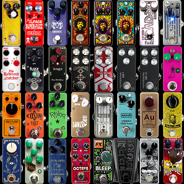
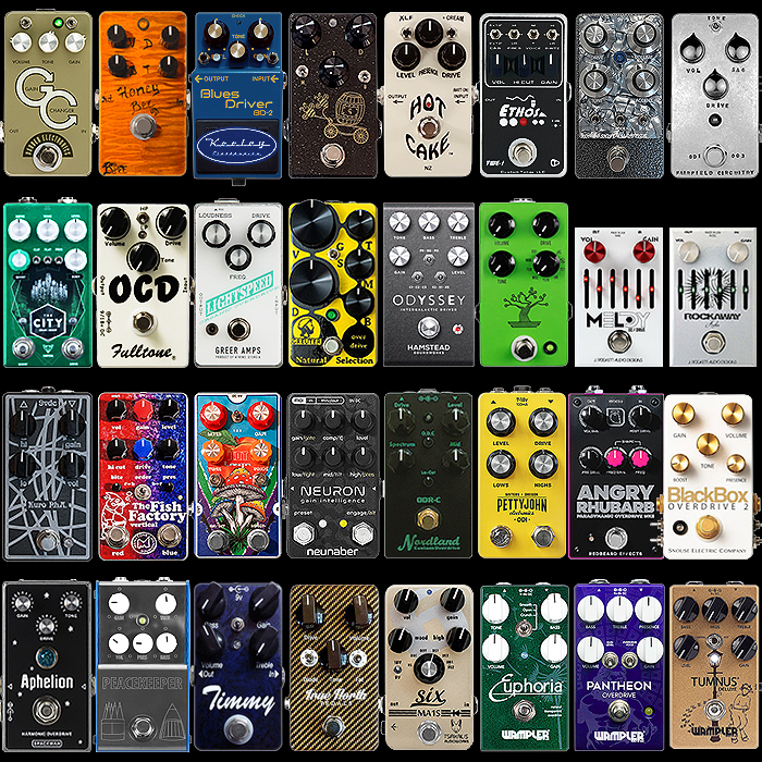
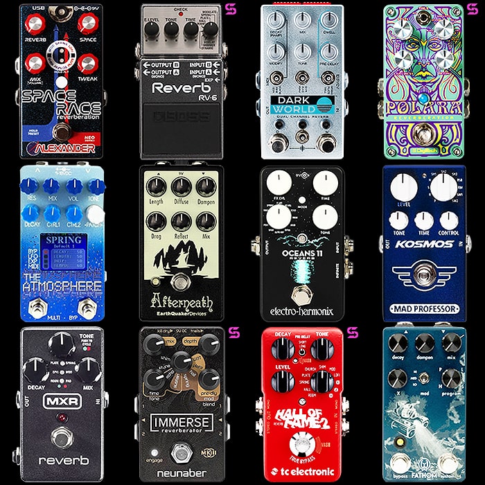
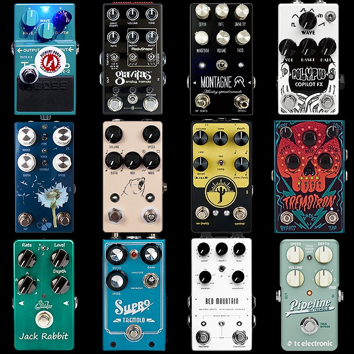
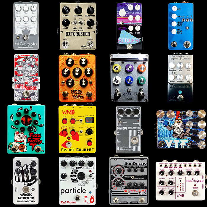
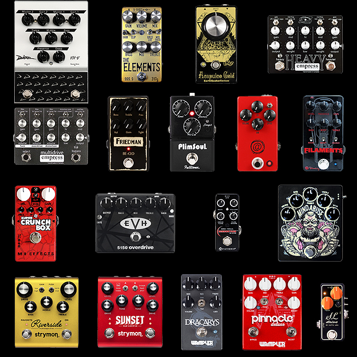
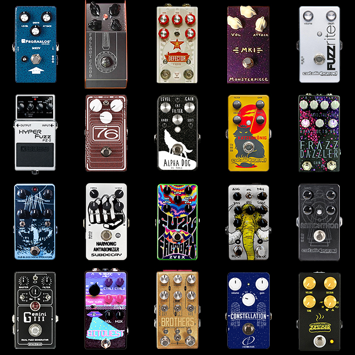
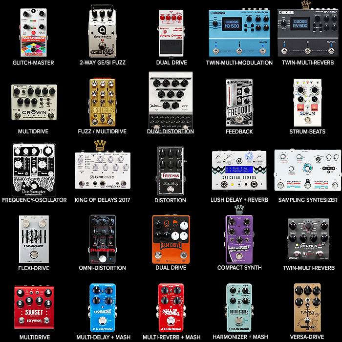
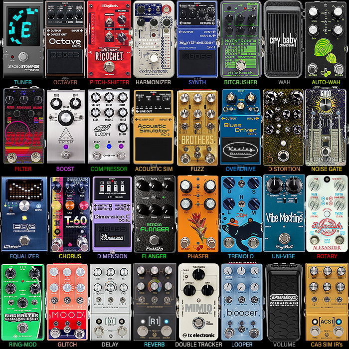
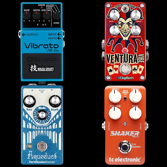
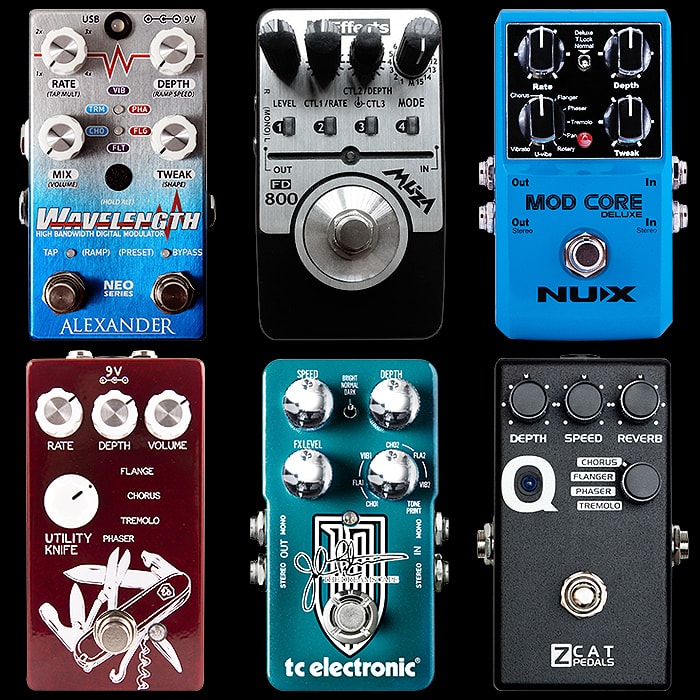
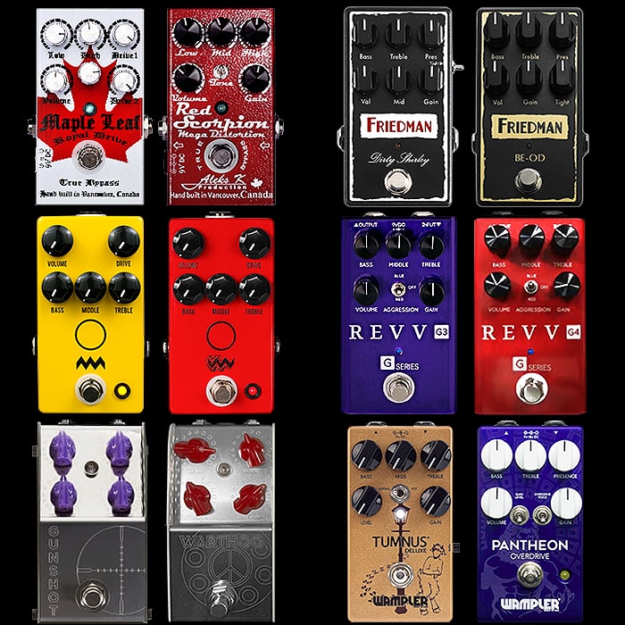
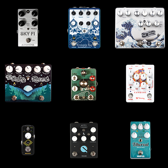
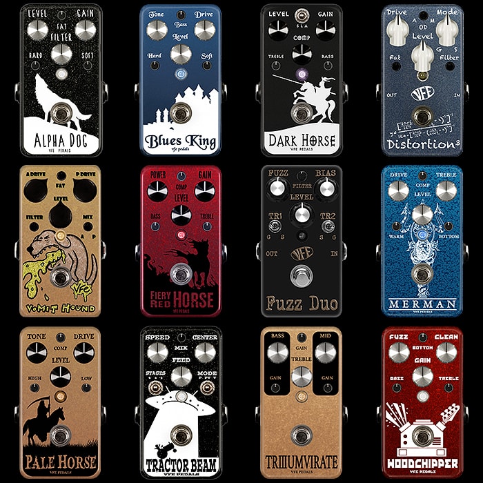
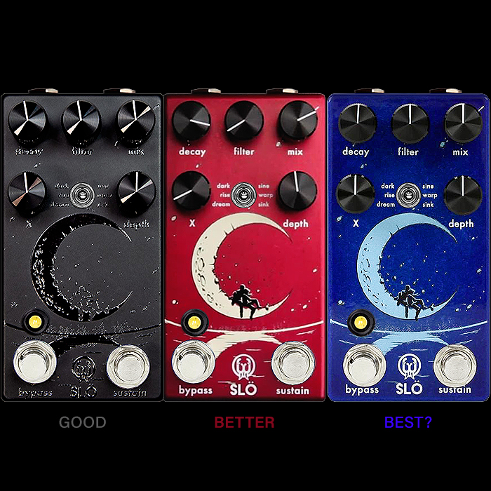
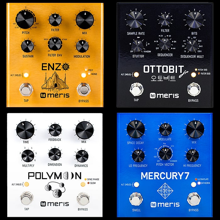
How important is the look of a pedal to its success?
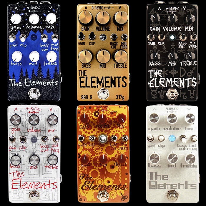
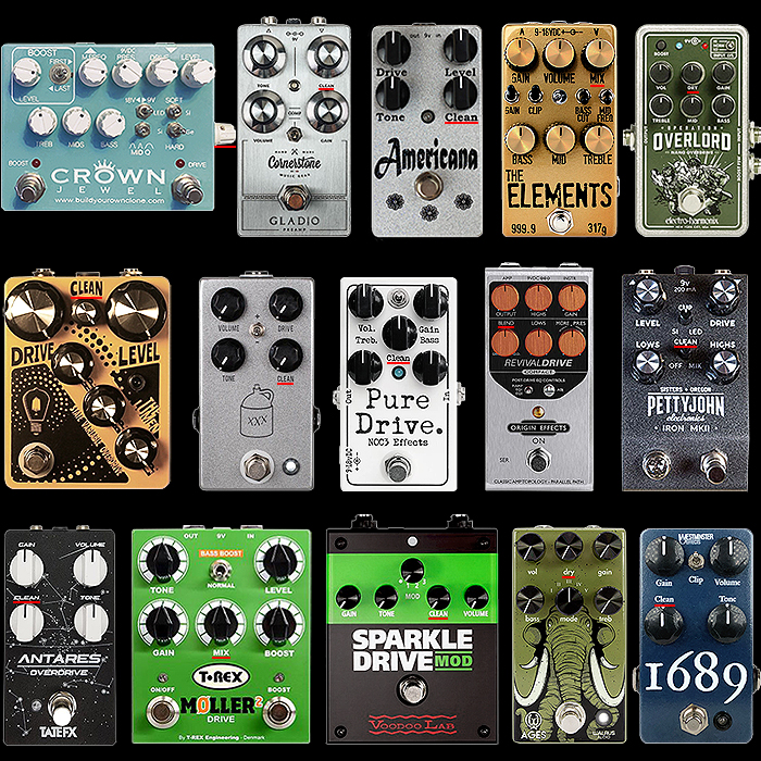
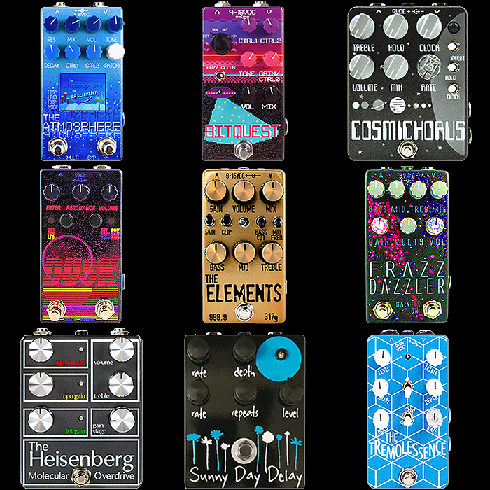
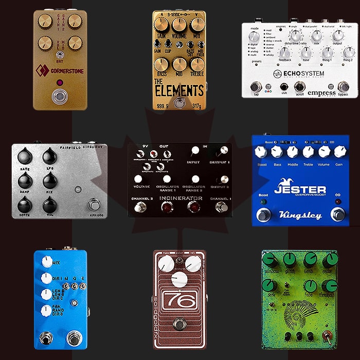
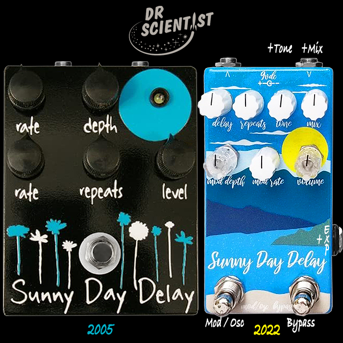
There’s plenty of pedals which come in different looks and/or are iterated over a period of years - with new editions ending up in a different colourway or completely different graphic design. My case in point is Dr Scientist’s superb The Elements pedal - which has significantly changed its look over the years - with different colours, graphics, knobs, toggle end-caps, LEDs etc.
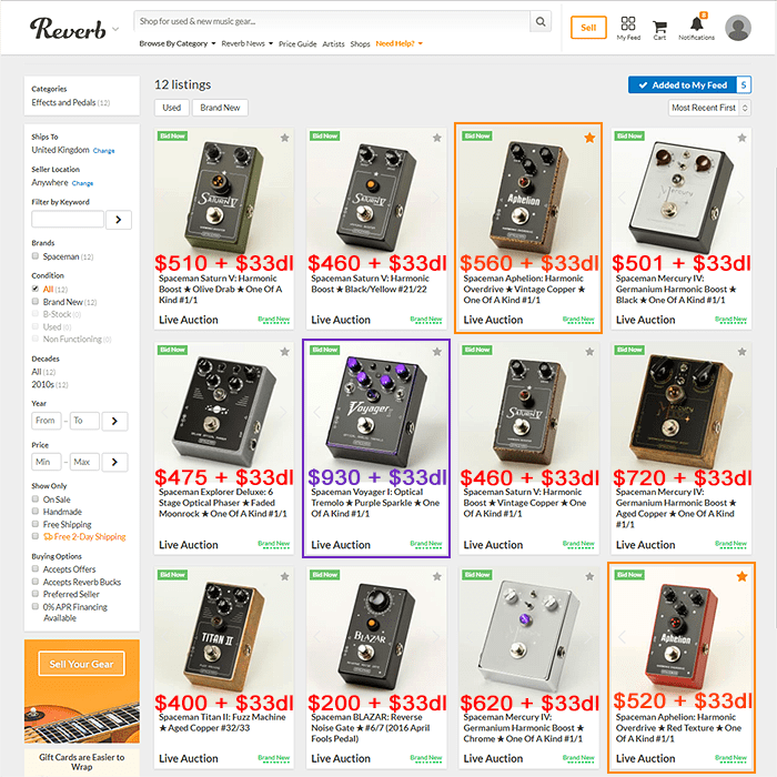
I believe the current iteration is the Black, Blue and White - Trees, Mountains and Stars version. Yet my favourite iteration and the one that I acquired last year was the ’Gold Bar’ edition. I deliberately and very specifically sought out the Gold Bar version - which meant using Reverb.com and double-checking with the vendor that I would indeed be getting the gold version.
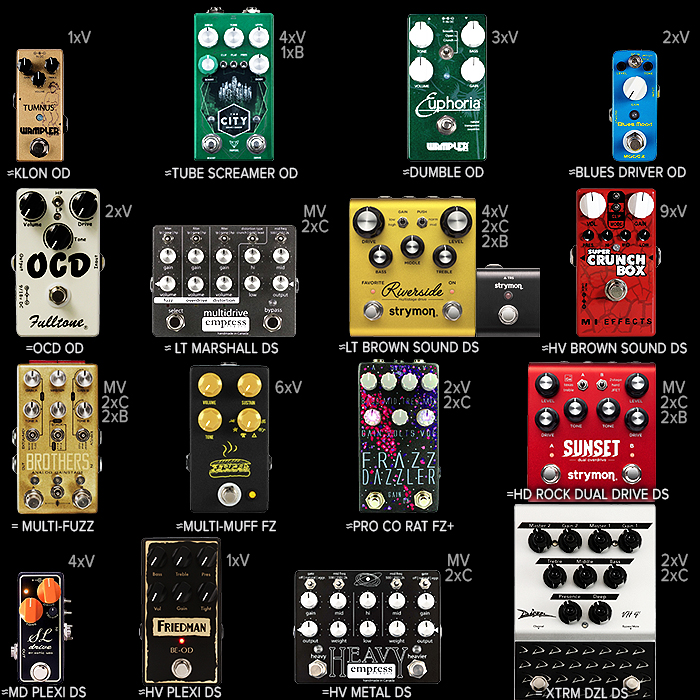
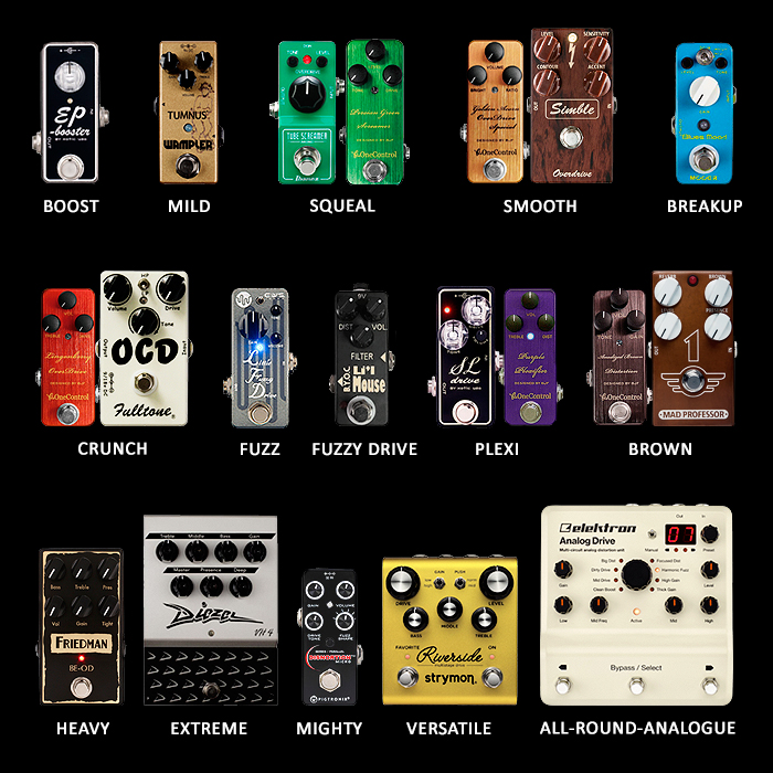
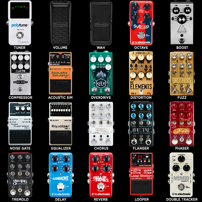
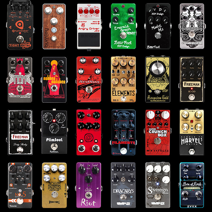
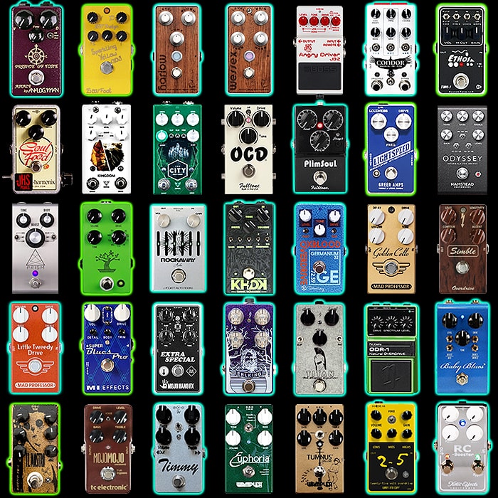
Certain pedal types / categories are associated with very specific colourways - Tubescreamers (Green), Klones (Gold/Silver), Blues Drivers (Blue), Marshall (Gold), Vox (Russet) etc. Certain names and graphics also suit and conjure up certain complementary colourways and graphics, as do certain tones and textures, so all of these may be influential in persuading the consumer to go for the look of a particular pedal.
While all the different Elements iterations are decent interpretations of ’Elements’ themes, some of these can look overly fussy and thus more inherently confusing. My preferred edition is easily the ’Gold Bar’ version, with their earlier pretty much all-white version my second-favourite. I find the material elements approach the best route here - i.e. you could do gold, silver, copper etc. metal versions of the pedal. I don’t feel the latest edition necessarily serves the pedal or underlines its inherent quality as well as it could.
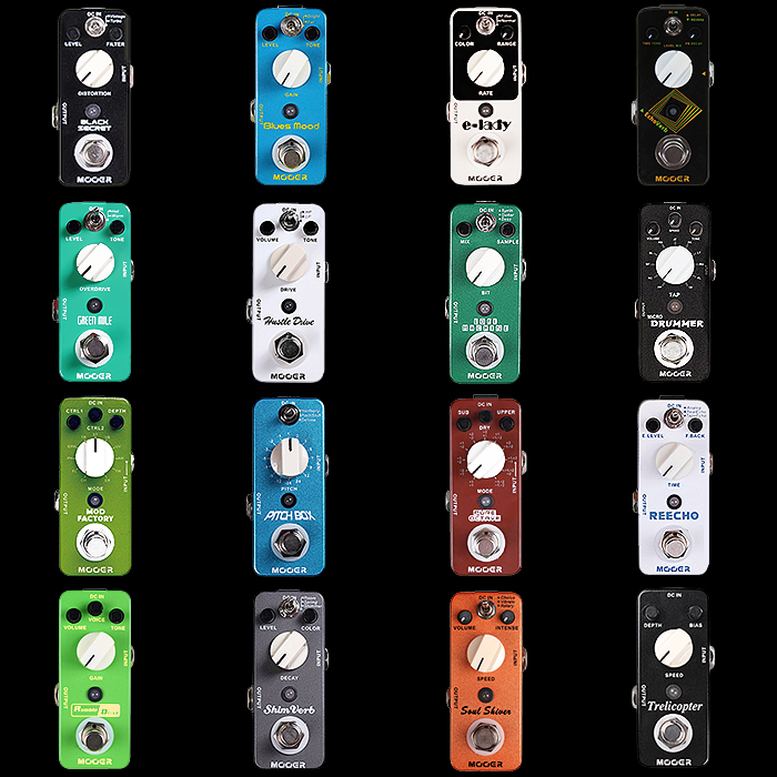
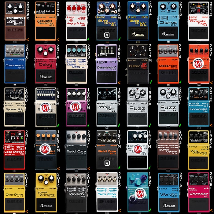
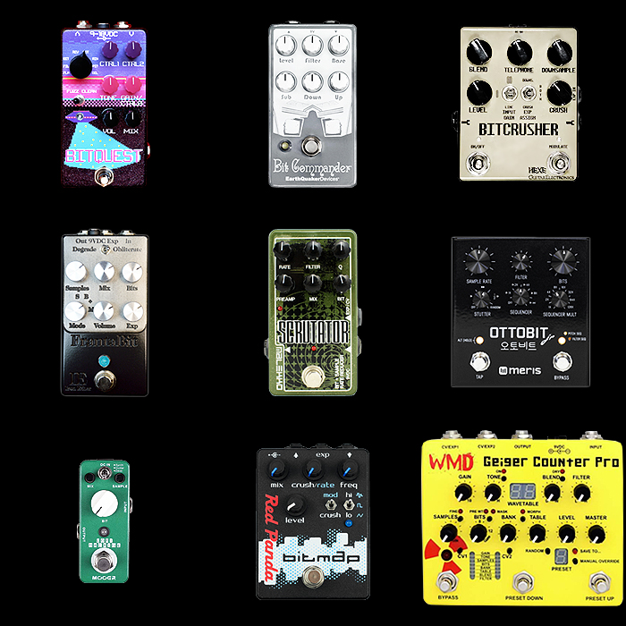
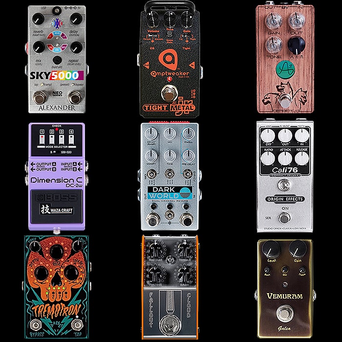
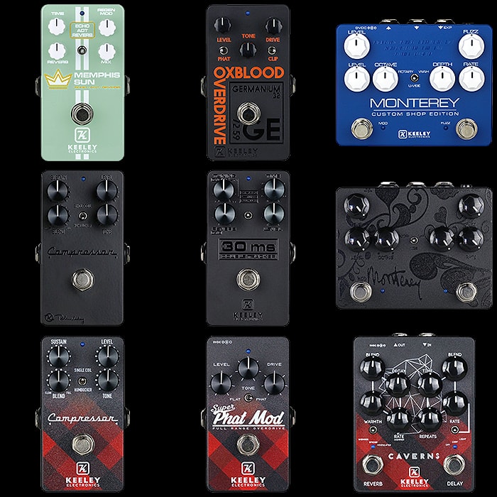
I know that several players have been turned off a pedal or two when they did not like the colour or design of that pedal - in the same way lots don’t like certain guitars for similar reasons. When you look at Boss and MXR which have very set colourways per category - and the only graphic design being in the fonts and placement of text and labels - it all leans towards a certain utlity in colour-coordination.
For my Bogner Burnley I specifically acquired the Bubinga wood top-plate edition of that pedal - as I felt it really suitably reflected the smoothness, warmth and richness of that pedal’s tone. Some pedal are just better served by certain design values - which help define very much what that pedal is about, and even how it might sound. There is no question in my mind that the visual is finely connected to the auditory components and helps reinforce and substantiate those particular qualities.
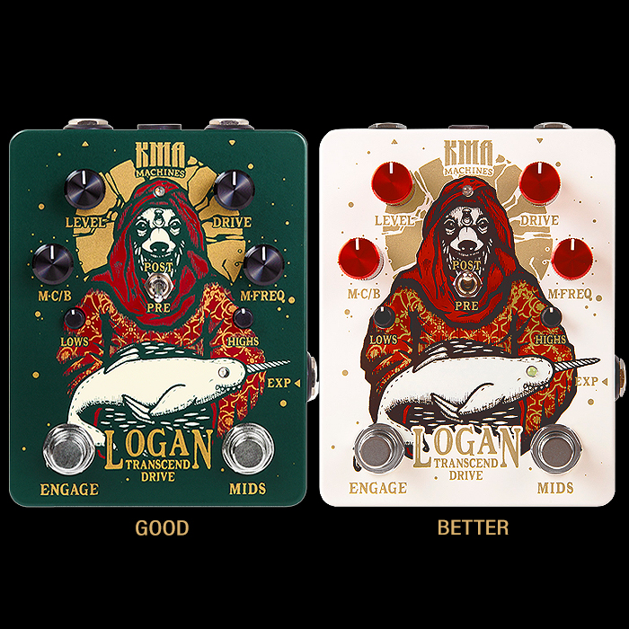
As far as I am concerned, a look of a pedal is a key influencer - and can and should be used to underline quality and justify price, as well as any number of subtle but distinct differentiators and identifiers. If you get those elements wrong - you will almost undoubtedly end up sacrificing sales somewhere along the line. You can frequently see on Reverb.com that certain pedal editions fetch a significantly lower price and sell slower that those which have a broader and more succinct appeal.
So pedal-makers must be aware of those players who listen with their eyes as well as their ears!

