Pedal Design 101 - Generating better brand impact and recall via Uniquely Themed Stylised Graphics
I’ve done a few articles on this site about the look and feel of a pedal - different iterations and editions of pedal design, and specific unique designs of pedal enclosures for instance. I’ve often said that with so much competition in the pedal game currently - you have to nowadays put some significant effort into differentiating yourself as a brand, to make your pedals more impactful, more appealing and more recognisable.
The central tenets of branding are to produce uniformly styled / stylized products where the look and feel imbues said products with higher level values which make ownership more appealing and more enjoyable overall. While doing my various pedal roundups - particularly the country-based ones I did last year, I came across a number of ’brands’ that weren’t really brands at all - in that the pedals they sell were/are a hodgepodge of entirely unrelated designs with vastly different graphic styles, enclosure types and knobs even.
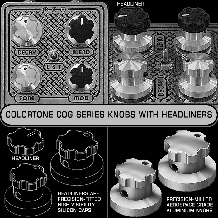
One of my next features will actually be about the use of different knobs (the very next actually) - and which brands have become associated with a particular type, and how knobs can be a significant brand differentiator themselves. For this feature we are really just focusing on the graphic design of the pedal - where pedal-makers may be using just standard Hammond type enclosures and Boss-style knurled knobs, and need some other significant means to differentiate and set their brand image apart from others.
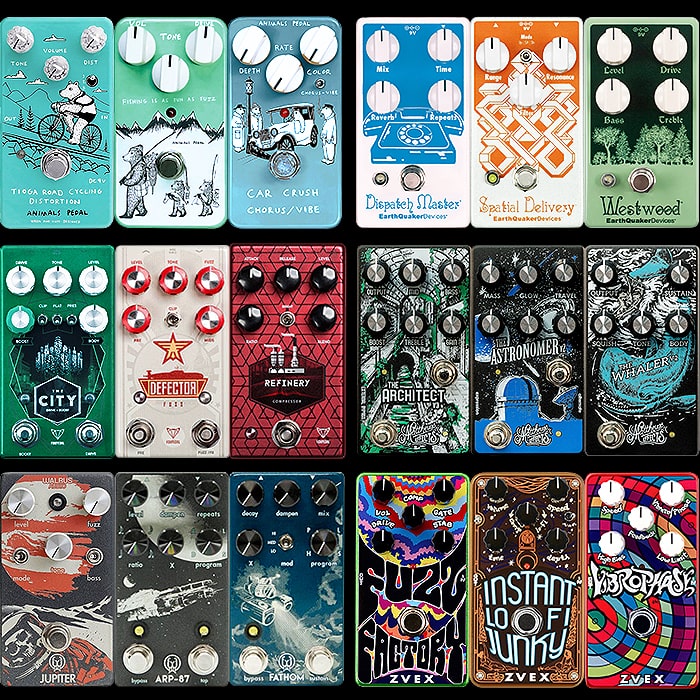
I have picked 6 brands here which I feel have a pretty good ’Family’ style across their pedals, although there are often odd inconsistencies here too - which I will endeavour to highlight. I will explain why I selected these particular brands, and why I excluded some of the other well-known ones. Note also that I am not including any here which have unique or significantly differentiated enclosure designs as featured in a previous article. This article is really just about the graphics - which is why I have excluded all the peripheral details from each of the pedals I feature above. I have selected 3 of the best / most uniformly designed pedals from each of those ranges - and will make notes on out of the ordinary and unexplained deviations too, and which iterations don’t work as well as the others.
The 6 selected reference brands are pictured in alphabetical order - and feature the best looking pedals from those ranges - arranged as symmetrically and in as complementary a fashion as possible:
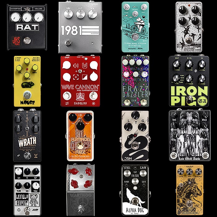
Animals Pedal, Japan (animalspedal.jp)
With Graphic Design - it's usually a combination of 3 core ingredients - Illustration, Typography and Colour. For Japan's Animals Pedal it's mostly about Swedish illustrator Jonas Claesson's whimsical animal graphics, but the hand-drawn typography and use of mostly pastel colours is important too. This pedal range is instantly recognisable and all the pedals obviously fit within that overall family look. One improvement here would be a more uniform positioning of the actual brand name 'Animals Pedal' which actually appears all over the place currently - but would undoubtedly sit best near the base of the design - as per the newest and first pedal pictured. Of course you need to factor in consumer sensibilities here, as there will be players for whom all this is a little too twee, and they might be discouraged from buying slightly toy-like looking pedals. I rather quite like them, but do think that they could be improved with a touch more uniform application of key elements. I also feel that the clear / transparent 1900 series knobs are probably the way to go here (per the Tioga) - as well as more uniformity in the application of the graphics - the combination of black and white illustration with the core background pastel colour looks great and is why I selected those 3 above. Finally, I feel that they could do with a slightly more usable website!
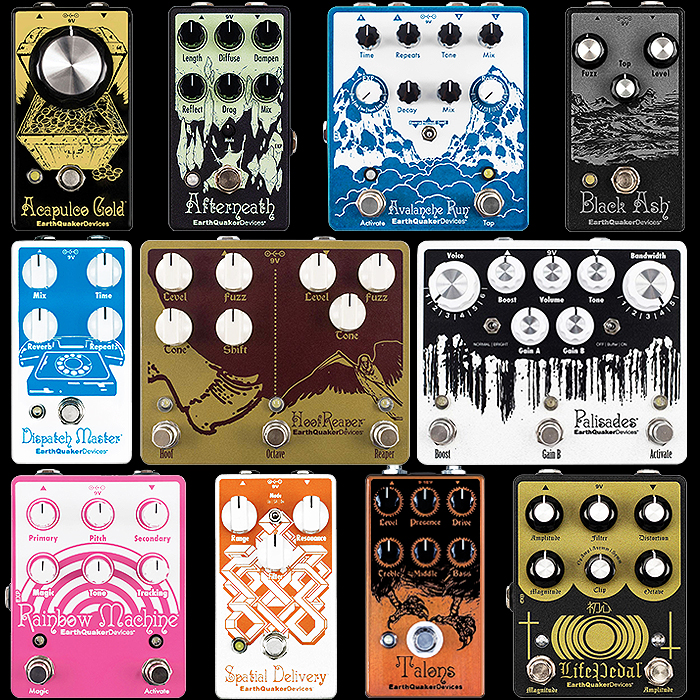
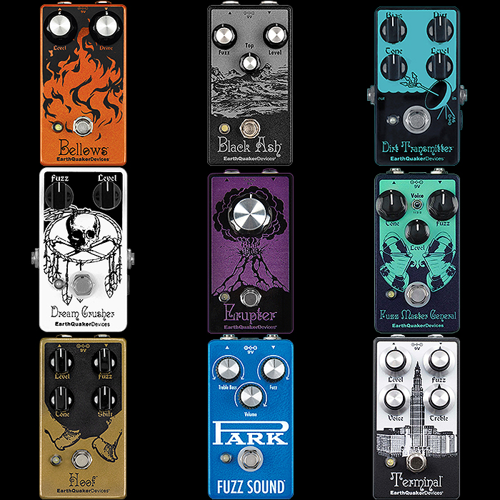
EarthQuaker Devices, USA (earthquakerdevices.com)
Jamie Stillman's well loved brand is actually a little less uniform than I had originally perceived. There is obviously a clear family look in the styling of the facia and typography - while the style of illustration seems to vary somewhat, as does the choice of knobs! I very carefully selected the above trio for their overall similarity of look, and they're all sporting Davies 1510 series style knobs, while throughout the range we also see a mix of 1900 series, Davies 1100 Boss style series, Philmore 3060 series, and MXR ECB-071 style series etc. - by contrast JHS uses almost exclusively the MXR-style knobs as far as I'm aware. The key unifying elements of the EQD pedals seem to be the frame-like styling of the pedal facia, and the pretty much consistent typography and placement at the base of the facia - although there are a number of exceptions to that too. In the main though if you lay down a number of EQD pedals next to each other on your pedalboard - they all pretty much look like they belong together - which is one of the key aims of uniform branding. The more subtle part is the subconscious influence to acquire more of the same. I personally am still to acquire an EQD pedal for the collection - even though I have a number on my rolling wishlist. The range works pretty well all said, but could be tightened up for even more uniformity which would likely raise its quality perception to a still higher level.
Foxpedal, USA (foxpedal.com)
Foxpedal remains something of an enigma since the departure of former head-honcho Todd Billow - I'm not entirely clear on exactly who is running the show now. I have though over the years acquired 4 of their pedals - The City, Defector, Kingdom Combo and Wrath - which I was partly drawn to initially by their designs - colours, graphics, typography, knobs etc. The pictured trio are sporting two different styles of knob - the Boss/1360 and MXR/1250 style and there are further difference across the whole range. There is very much a family look for many of the pedals in the range - although some discrepancies and exceptions too. All three above benefit from elegant geometric details within the graphic design which raise the pedals up a notch. All-round they look to be of a high quality. Although why The City Boost button is a different colour (cool), and not the Defector one is surely an oversight / lack of consistency. The logo/brand application is consistent though with a smart choice of quality colour tones. Most may not be that familiar with Foxpedal, but when you first run across the range you should immediately recognise a certain level of attention to detail applied here - which raises the quality/appeal of these pedals. The right branding and design can do many things for a product besides making them stand out and be memorable. It can also set expectation of quality and pricing - so that if you are selling an expensive boutique pedal - the design has to be in line with that or else customers may feel short-changed. There are various ways to go about this - choice of materials etc. it does not have to be in the graphics - but if you're using a common enclosure / chassis type and standard regulation knobs etc - then the graphics, typography and colour choices are really what define your pedals' position in the marketplace.
Matthews Effects, USA (matthewseffects.com)
Rick Matthews has hit the big leagues now in terms of being rep'd by Boutique Amps Distribution - the pedal manufacturing base for Bogner, Diezel, Friedman, Morgan, Wampler - and now Matthews Effects. You can see a step change in the uniformity of design now - with this compact but bijoux range of 5 pedals all wholly uniformly styled now, and all sporting Boss-style 1360 series knobs. I prefer the mostly 2-tone colour combination of the above 3, while I find the slight colour clash of the other 2 pedal designs not pictured slightly less appealing - although the uniformity of graphics, layout etc. is unequivocal - and Matthews Effects has obviously very much retained the slightly left-field feel of the brand's provenance. It is quite understandable with larger ranges - why you can't streamline the whole range in one go, but I have to say that this latest update to the Matthews line is the best one yet. The only downside here really is the legibility of some of the knob / parameter legends in amongst those rather busy graphics - yet I'm delighted that the transition managed to preserve so well the essence of this brand. I hope Rick benefits appropriately from this extended degree of distribution. Will be interesting to see who Boutique Amps round up next!
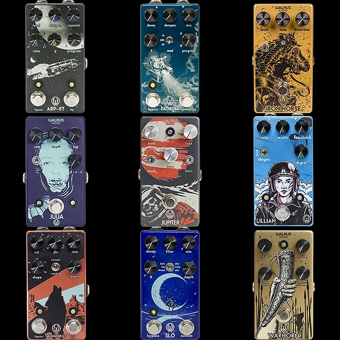
Walrus Audio, USA (walrusaudio.com)
I'm happy to report that Walrus Audio uniformly use the same style of knobs throughout - aluminium 13mm with ribbed edges mostly in black, but in silver on the Jupiter Fuzz. The brand position and style of graphics / illustration is consistent throughout - as is their use of muted colours. Thematically though there is some degree of discrepancy - with a Hi-Tech Space-Age theme on some pedals, sort of landscapes on others and some female figureheads as a third variation. I feel that they could sit more uniformly within a singular theme - although illustratively each pedal still feels it mostly belongs to the same family - the exceptions being the Emissary and Luminary really. I believe Walrus bill themselves as Art and Artistry combined or something along those lines, and the pedal designs certainly ring true to those sentiments. There is certainly a large degree of uniformity here, although I believe universally/thematically the graphics could be closer still overall.
Zvex, USA (zvex.com)
Zachary Vex's eponymous pedal brand is an interesting case study here as the traditional range of horizontal format pedals always had two iterations - hand-painted and more mass-market 'Vexter' versions of each type. I personally have never been a fan of the horizontal format, and this sort of kept me away from Zvex until they launched new vertical editions of their classic pedals with beautifully bold designs where the typography also plays an important part in the overall layouts. The new vertical range now numbers 7 - and I have 3 of my favourites pictured above, two of which are already in my collection. Here Zvex have gone down the more design-led hand-painted-style route versus the more industrial stripped-back Vexter look which are around the same price (Horizontal models). So kudos to Zvex for doing the right thing here - and they mostly universally use the 1900 series style knobs in black or white. The actual graphics vary quite significantly from pedal to pedal - but the use of bold bright patterns with a heavy focus on typography definitely sets most of these apart. This is a fine branding exercise all-round - which again manages to communicate the personality of the brand brilliantly - through those graphics,
Final Thoughts
I had quite a long list of potential references for the above feature, and could have included various others too - like JAM Pedals - whose bold bright graphics are uniform and a proper brand asset for them too. I really wanted/needed mostly compact pedal ranges to fit in with my theme, and this meant that some brands weren't as suitable in this instance. There were a couple I deliberately excluded here even though I really love them as brands and have several pedals from each, as their pedals are of the highest quality - it's just that they have so many copyists that their core format has become almost ubiquitous.
Foremost among these is JHS with its uniform MXR style knobs and cool simple outline graphics - symbols really and primary colours of enclosures - a formula so successful that there are a myriad of other pedal companies which do variations along very similar themes - the style of illustration may be slightly different or the line colours more pronounced - but it's still very much that type of simple outline graphic on a bold uniform background colour.
The same goes for Wampler to a degree with its uniform 1510 series knobs and mix of subtle and bold graphics. I feel that graphically Wampler could be more uniform in the type and style of illustration. The pedals obviously look high quality, but there are certain thematic inconsistencies which can niggle. I feel pedals like the Euphoria, Pantheon and Sovereign are totally along the right lines, while others - like the Hot Wired, Plexi-Drive and Velvet Fuzz are hewn from quite a different stratum.
When brand assets are properly deployed they should help you sell more - as your pedals will have more appeal, be more memorable and are more likely to trigger/spark additional purchases. If you get the formula right - people should ideally want to get the rest of your range. So within the discipline of graphic design there are several identifiers and differentiators you can make use of - and if you are going to be using a standard enclosure then you had better get your graphics right to differentiate and elevate yourself sufficiently form your key competitors.
Next time I will be focusing on the task of selecting the right sort of knob/s for the same purposes (brand elevation) - as we continue with this series of insights.

